Dewluxe
Industry
Skincare
Client
DewLuxe
Service
Brand Identity
Date
AUGUST 2024
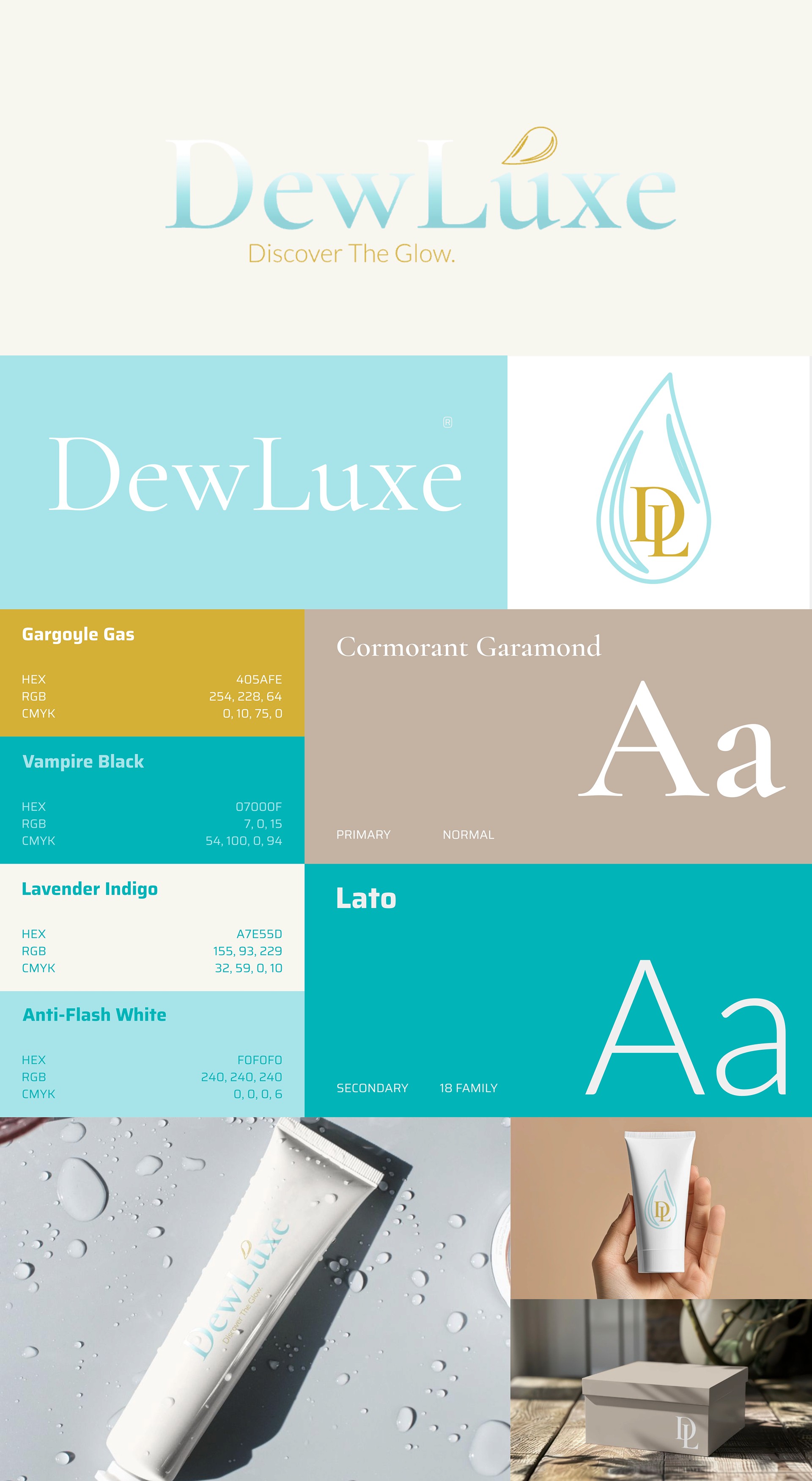
Brand Name: Dewluxe | Industry: Skincare and Beauty
Brand Overview: Dewluxe is a premium skincare brand focused on delivering glowing, hydrated skin using nature-inspired formulations combined with cutting-edge science. The brand celebrates luxury in simplicity, offering products designed for clean beauty enthusiasts who value high-quality, eco-conscious, and cruelty-free skincare.
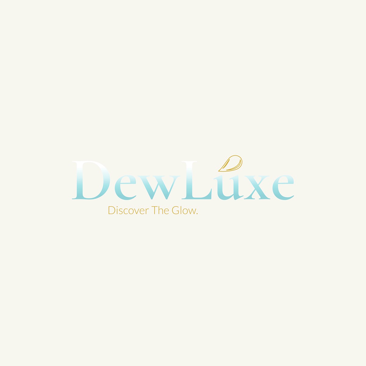
Logo Concepts:Main Logo:Design: The brand name "Dewluxe" is in an elegant serif font with rounded edges. The "Dew" is stylized with a gradient that mimics the effect of light catching a water droplet. A small, minimalist water droplet icon sits above the "u."Color: Soft beige and a pearlescent aqua gradient to evoke hydration and luxury.
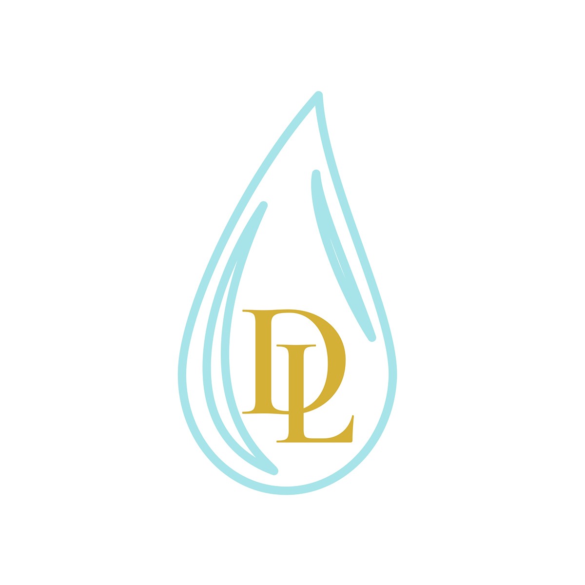
Secondary Logo:Design: A simple outline of a water droplet encasing the letters "D" and "L" intertwined in a sleek, minimal script.Color: Aqua on a soft beige or white background.
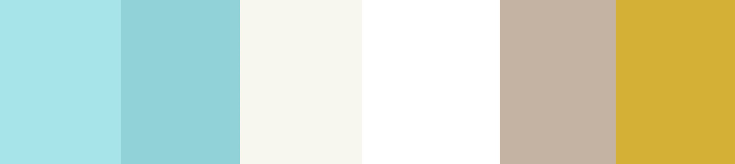
Color Scheme:
Primary:Aqua Gradient (representing hydration and glow):Start Color:
#A7E4E9End Color:#8FD3D9Soft Beige:
#F8F5F1Secondary:Pearl White:
#FFFFFFWarm Taupe:
#C3B3A4Muted Gold:
#D4AF37
Typography
Primary Font "Cormorant Garamond" (Serif) – Classic and luxurious, ideal for headlines and brand names.Weights: Medium, Bold.
Secondary Font:Font Name: "Lato" (Sans-serif) – Clean, modern, and simple, perfect for body text and descriptions.Weights: Light, Regular.
Brand Guidelines
Logo Usage:The gradient logo should be used for digital applications and on packaging for a luminous, eye-catching effect.The secondary logo is best for embossing or minimalist applications like seals, stamps, or social media icons.
Color Usage:Aqua Gradient is the standout color, used sparingly to highlight hydration-related elements (e.g., product names, logos).Soft Beige is the primary base for backgrounds and packaging. Muted Gold should be used for accents on premium items, like limited edition packaging or embossed detailing.
Imagery:Soft-focus photos with a luminous glow.Nature-inspired textures like dewy leaves, flowing water, or serene glass surfaces.Clean, minimalistic flat lays of products with natural props (e.g., eucalyptus, quartz).
Tone of Voice:Gentle, aspirational, and informed. The voice should educate while evoking a sense of calm luxury. Phrases like "reveal your glow," "nourish from within," and "luxury for every day" align with the brand identity.
Brand Applications:Business Card:Front: "Dewluxe" logo in Aqua Gradient on a soft beige background.Back: Contact information in Warm Taupe, with a small water droplet icon in Aqua at the bottom.
"Packaging:Primary containers (serums, moisturizers) in frosted glass with soft beige labels, Aqua Gradient accents, and embossed gold text. Box packaging is recyclable kraft paper with minimalist designs, featuring a touch of Muted Gold.